Visualize
Diana LaScala-Gruenewald
7/1/2021
Read Data
# load libraries
library(here)
library(readr)
library(DT)

# define variables
url_ac <- 'https://oceanview.pfeg.noaa.gov/erddap/tabledap/cciea_AC.csv'
csv_ac <- here('data/cciea_AC_url_download.csv')

# Download data
if (!file.exists(csv_ac))  # No {}?
  download.file(url_ac, csv_ac)

# Read data
d_ac <- read_csv(csv_ac, col_names=F, skip=2)
##
## ── Column specification ────────────────────────────────────────────────────────────────────────────────
## cols(
## .default = col_double(),
## X1 = col_datetime(format = "")
## )
## ℹ Use `spec()` for the full column specifications.names(d_ac) <- names(read_csv(csv_ac))##
## ── Column specification ────────────────────────────────────────────────────────────────────────────────
## cols(
## .default = col_character()
## )
## ℹ Use `spec()` for the full column specifications.# Show data
datatable(d_ac)Plot data statically with ggplot2
Simple line plot + geom_line()
library(dplyr)
library(ggplot2)

# Subset data
d_coast <- d_ac %>%
  # Select columns
  select(time, total_fisheries_revenue_coastwide) %>%
  # Filter rows
  filter(!is.na(total_fisheries_revenue_coastwide))

datatable(d_coast)
# Create ggplot object
p_coast <- d_coast %>%
# Setup aesthetics
ggplot(aes(x = time, y = total_fisheries_revenue_coastwide)) +
# Add geometry
geom_line()
# Show plot
p_coast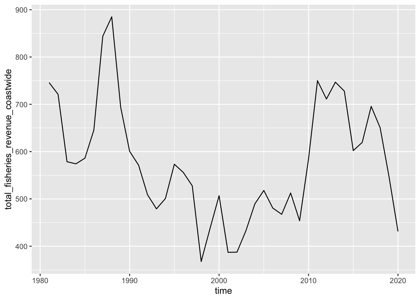
Trend line + geom_smooth()
p_coast +
  geom_smooth(method = 'lm')
## `geom_smooth()` using formula 'y ~ x'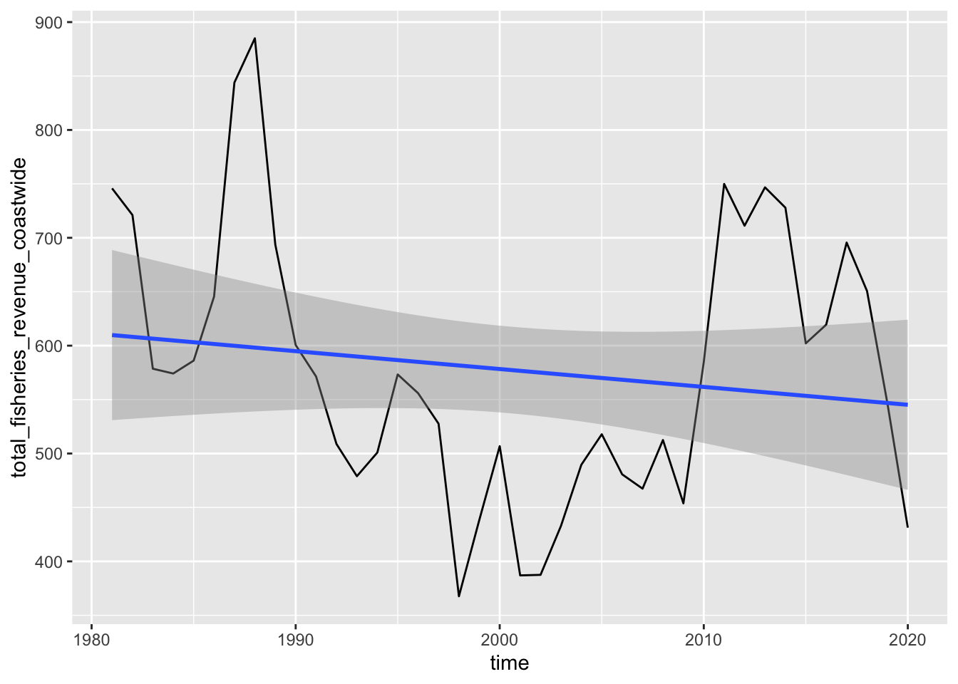
Distribution of values + geom_histogram()
Note that geom_histogram() plots the frequency of values for a single variable.
d_coast %>%
  # Setup aesthetics
  ggplot(aes(x = total_fisheries_revenue_coastwide)) +
  # Add geometry
  geom_histogram(bins = 10)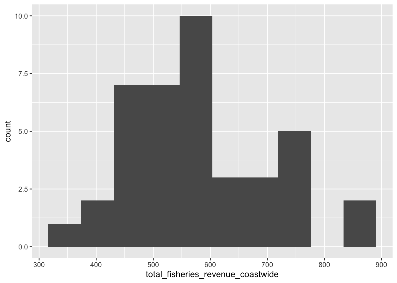
Series line plot aes(color = region)
library(stringr)
library(tidyr)

# Create data aggregated by region
d_rgn <- d_ac %>%
  # Select columns
  select(
    time,
    starts_with('total_fisheries_revenue')) %>%
  # Exclude coastwide data
  select(-total_fisheries_revenue_coastwide) %>%
  # Pivot longer
  pivot_longer(-time) %>%
  # Create region column
  mutate(
    region = name %>%
      str_replace('total_fisheries_revenue_', '') %>%
      str_to_upper()) %>%
  # Filter missing values
  filter(!is.na(value)) %>%
  # Select columns
  select(
    time,
    region,
    value
  )

# Create plot object
p_rgn <- d_rgn %>%
  # Setup aesthetics
  ggplot(aes(
    x = time,
    y = value,
    group = region,
    color = region)) +
  # Add geometry
  geom_line()

# Show
p_rgn
Update labels + labs()
p_rgn <- p_rgn +
  labs(
    title = 'Fisheries Revenue',
    x = 'Year',
    y = 'Millions $ (year 2015)',
    color = 'Region'
  )
p_rgn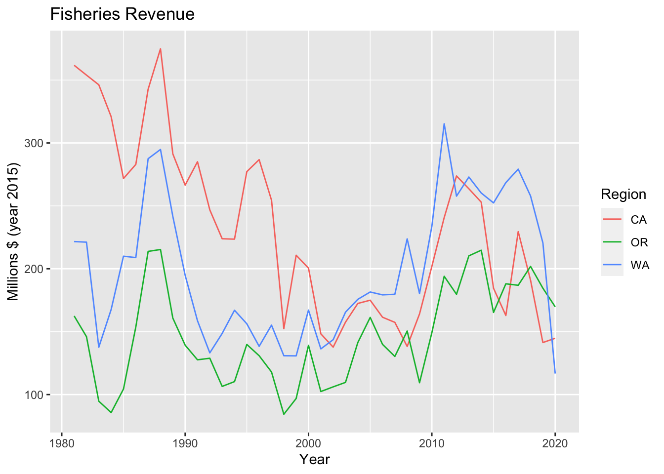
Multiple plots with facet_wrap()
p_rgn +
  facet_wrap(vars(region))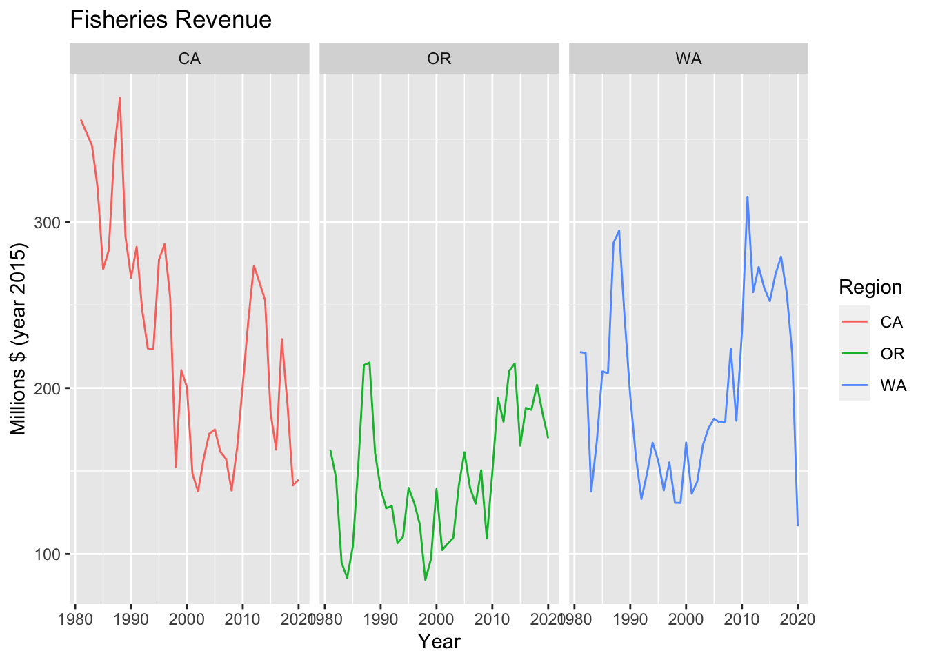
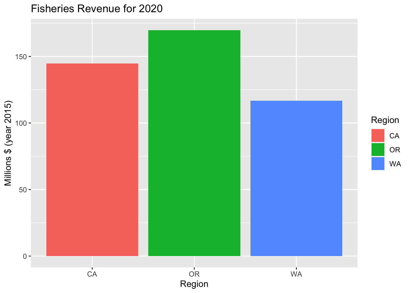
Bar plot + geom_col()
Note that geom_col() plots both an x and y variable (e.g. revenue by region), while geom_bar() plots only an x variable (e.g. the number of revenue values for each region).
library(glue)
library(lubridate)

# Get most recent year in the data
yr_max <- year(max(d_rgn$time))

# Plot revenue by region for most recent year
d_rgn %>%
  # Filter by most recent time
  filter(year(time) == yr_max) %>%
  # Setup aesthetics
  ggplot(aes(x = region, y = value, fill = region)) +
  # Add geometry
  geom_col() +
  # Add labels
  labs(
    title = glue('Fisheries Revenue for {yr_max}'),
    x = 'Region',
    y = 'Millions $ (year 2015)',
    fill = 'Region'
  )
Contrast with geom_bar(). Also note that color only changes the outline color, while fill changes the color of the entire bar.
d_rgn %>%
  ggplot(aes(x=region, color=region)) + geom_bar()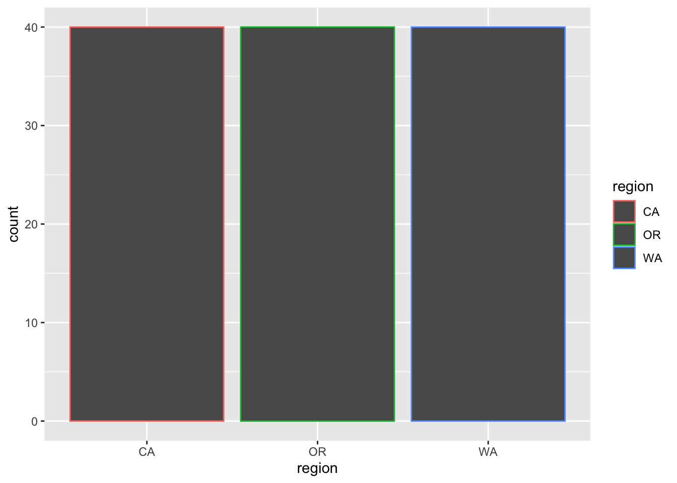
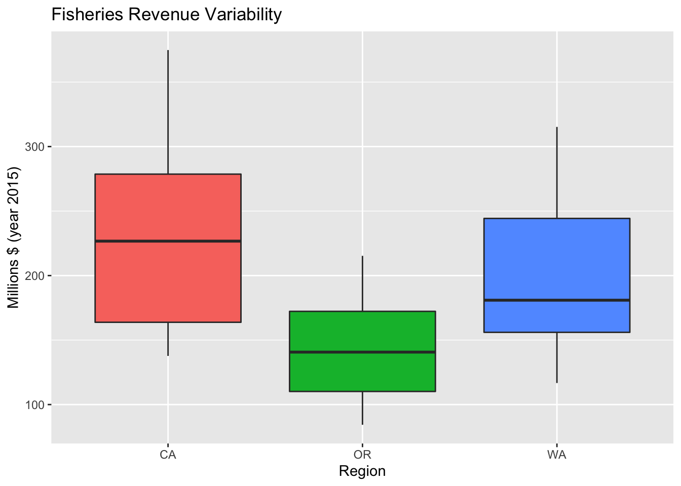
Variation of series with + geom_boxplot()
d_rgn %>%
  ggplot(aes(x = region, y = value, fill = region)) +
  geom_boxplot() +
  labs(
    title = 'Fisheries Revenue Variability',
    x = 'Region',
    y = 'Millions $ (year 2015)') +
  # Do not include a legend since it's redundant with the x axis
  theme (
    legend.position = 'none'
  )
Variation of series with + geom_violin()
p_rgn_violin <- d_rgn %>%
  ggplot(aes(x = region, y = value, fill = region)) +
  geom_violin() +
  labs(
    title = 'Fisheries Revenue Variability, Violin Plot',
    x = 'Region',
    y = 'Millions $ (year 2015)') +
  theme(
    legend.position = 'none'
  )

p_rgn_violin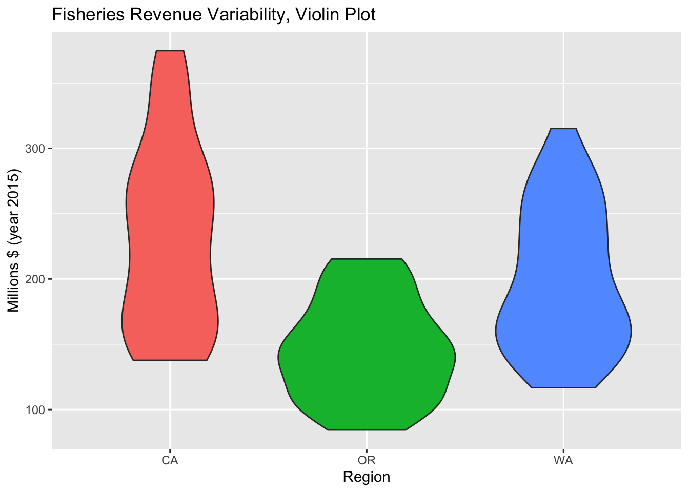
Change theme with theme()
p_rgn_violin +
  theme_classic()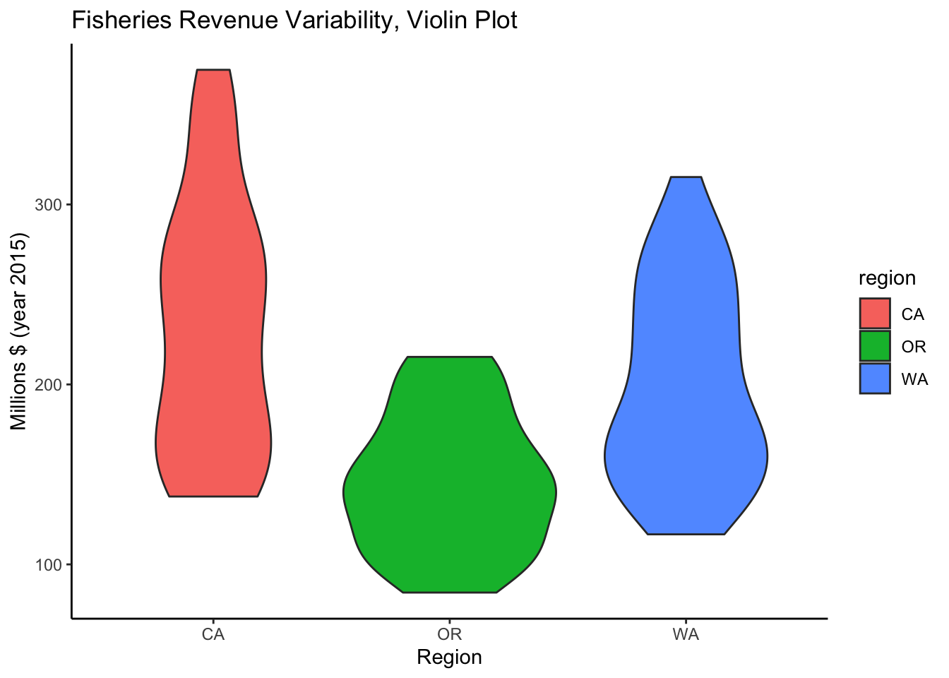
Plot interactively with plotly or dygraphs
Make ggplot interactive with plotly::ggplotly()
plotly::ggplotly(p_rgn)Create interactive time series with dygraphs::dygraph()
This package is written more specifically for time series data. It requires wide format data.
library(dygraphs)

d_rgn_wide <- d_rgn %>%
  mutate(
    Year = year(time)) %>%
  select(Year, region, value) %>%
  pivot_wider(
    names_from = region,
    values_from = value)

datatable(d_rgn_wide)
d_rgn_wide %>%
dygraph() %>%
dyRangeSelector()